


How to Choose Colors and Wood Tones For Your Home Design
October 28, 2025Highlighting and featuring wood elements and accents can elevate your home design. When done well and paired with the right design features, colors, and decor, it can work in almost any style, from sleek modern looks to rustic farmhouse designs. The wood tones and colors make a big difference, and it’s important to get it right. Here are some considerations, general rules and tips, and mistakes to avoid to help you choose colors and wood tones for your home design:
- Considerations For Choosing Colors and Wood Tones
- Tips For Choosing Colors and Wood Tones
- Mistakes to Avoid When Picking Colors and Wood Tones
6 Considerations For Choosing Colors and Wood Tones For Your Home Design
There are a lot of details to consider when picking colors and wood tones for your home design. They all need to pair well together and enhance the overall aesthetic you’re looking for. These are some of the main things to consider when choosing colors and wood tones for your home design:
- Design style and theme
- Wood undertone
- Grain pattern
- Texture and finish
- Overall palette
- Lighting
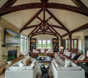 1. Design Style and Theme
The design style and theme you are trying to achieve will have a big effect on the decisions you make for overall design, decor, colors, wood tones, and more. Certain colors and wood tones will work better with some styles than others, depending on what else you want to include in your home design. Keeping a primary theme in mind can help you pick elements that work well together and work together to create the overall look and feel you want.
2. Wood Undertone
Wood tones tend to fall into light, medium, and dark categories, but this isn’t the only thing to consider. Woods also have undertones that will affect how they pair together, what else pairs well with them, and the mood and style of a design.
Red, orange, and yellow wood undertones are warm, while blue and grey wood undertones are cool. Whether you’re choosing exterior colors for your home or deciding on a palette for interior rooms, you want to make sure the colors you’re choosing pair well with the wood tones and undertones you’re planning to use.
 3. Grain Pattern
Grain patterns are another consideration for choosing woods and colors for your home. Some woods have prominent grain patterns that stand out, while others have simpler grain patterns that are subtler design elements. Woods with prominent grain patterns, like oak, can be a focal point.
However, if your goal is a subtler wood design accent that blends into the background more, then a prominent grain pattern might clash or look off. Thinking about the overall design and how a particular wood element will fit into it can help you choose woods with grain patterns that create the look you’re going for instead of distracting from it.
4. Texture and Finish
In addition to tones, undertones, and grain patterns, you also want to consider the texture and finish of the woods you’re choosing. This has a big effect on the look and feel of these elements, and can affect what colors will work best with them. Plus, the texture and finish of wood elements can enhance specific design styles.
Although smooth, glossy finishes can work well with several types of farmhouse styles, they tend to be more popular and fit better with modern looks. Woods with rougher, textured finishes give a rustic look and feel, and elevate a traditional farmhouse look, or other rustic styles. Rustic wood finishes can also pair well with industrial styles, unless the goal is sleek and polished.
 5. Overall Palette
There are a lot of details to consider when choosing what colors and woods are going to work best for your home design. The overall palette and how all of the details come together and interact with each other are important. This includes the colors, textures, patterns, and choices you make in rugs, textiles, other decor, and more.
All of these elements and how they come together will affect the overall style, mood, and atmosphere in a room. Color psychology and color perception can also come into play when choosing colors and wood tones for your home. Whether you’re trying to create contrast that works or complementary cohesion that blends, the tones and the overall palette can be the difference between what works and what doesn’t.
6. Lighting
Lighting is another consideration for choosing colors and wood tones. Natural light and other lighting options can affect how colors look, as well as the mood, atmosphere, and style of a room. When you’re thinking about the look and feel you want to create and the style you want, you can’t ignore lighting in those decisions.
Just as much as lighting can influence the colors you choose, the style and design choices you make in other areas can influence how you approach lighting in your home design. These are key things to consider when choosing interior paint colors. Your wants and needs in these areas can also help you narrow down options and choose the colors and wood tones that work best for you.
10 Tips For Choosing Colors and Wood Tones
As you work through considerations and different ideas for what you might like in your custom home, here are some tips for choosing colors and wood tones to help create the look and feel you want in a way that works:
- Start with a specific mood, feeling, or style.
- Pick your dominant color palette.
- Make sure your color palette is balanced.
- Plan colors around fixed elements.
- Stick with a similar undertone family when mixing woods.
- Embrace contrast with wood tones carefully.
- Choose paint colors that complement wood undertones.
- Consider room placement and lighting.
- Test colors and wood tones in natural light and indoor lighting.
- Repeat specific wood tones to make different tones look and feel intentional.
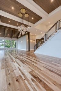 1. Start With a Specific Mood, Feeling, or Style
Your desired design and style of a room will have a big effect on the design and decor decisions you make for that room. Because of this, starting with a specific mood, feeling, or style can help you narrow down options and guide you through choosing colors and wood tones.
If you know how you want a space to feel, then you have some guidelines to work with for colors, wood tones, decor, and more. Light walls and colors paired with dark wood tones can set the stage for a modern look. Rich, saturated colors or accent colors paired with pale flooring provide a modern atmosphere with bold elements.
Warm neutrals paired with medium to dark woods with golden undertones can create a warm and cozy hygge vibe. Cooler tones paired with lighter woods tend to create a calm and airy atmosphere, which can be perfect for lighter farmhouse styles, coastal home decor, and other styles where light and airy is the goal.
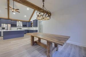 2. Pick Your Dominant Color Palette
Along with starting with a style, mood, or feeling, one of the tips for choosing colors and wood tones is to pick your dominant color palette. Determining your main color, secondary color, and accent color can help you pick the right colors and pair them with the right wood tones for the atmosphere you want to create.
3. Make Sure Your Color Palette is Balanced
With any interior design, you want your color palette to be balanced. A general guideline to follow is the 60-30-10 rule to help balance your color palette and avoid overwhelming the room. The 60-30-10 rule breaks down as follows:
- 60% – dominant/main color
- 30% – secondary color
- 10% – accent color
Generally, the dominant color shows up in larger pieces and surfaces, like large furniture and walls. The secondary color in your palette tends to show up in smaller furniture, rugs, and other textiles, while the accent color is usually a pop of color via accessories, art, throw pillows, etc.
When working with the design team of your custom home builder, there may be situations that don’t necessarily follow these rules. However, a good interior designer will make sure the overall effect meets your needs and still looks good.
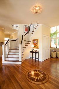 4. Plan Colors Around Fixed Elements
Another tip for choosing colors and wood tones for your home design is to plan your palette around fixed elements, specifically any fixed choices that you don’t want to change or can’t change easily, like flooring, countertops, etc.
Instead of picking colors and trying to make them work with any large, fixed design elements you already have in place, use the fixed elements as a guide and plan your colors around them. If nothing is defined yet, that is a different situation. But, if there are already fixed elements specified in the design, ignoring these and not planning colors around them can be a mistake.
5. Stick With a Similar Undertone Family When Mixing Woods
Just as you don’t want to stick to just one color in a room, unless you are intentionally going for a monochromatic look or color drenching, you don’t want to stick to too much of a single wood tone either.
However, it’s important to pay attention to the undertone of the woods you’re choosing, as well as the colors in your palette. Different undertones when mixing different woods can end up with them clashing. Instead, identify the undertone of the woods you want to use and stick to a similar undertone family when mixing different woods.
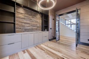 6. Embrace Contrast With Wood Tones Carefully
Whether mixing different woods or creating contrast with your wood tones, approach contrast carefully. When done right, you can create a subtle contrast with similar wood tones or a bigger contrast by mixing warm and cool tones, provided it’s done carefully.
Just as mixing different undertones can clash, too much contrast can lead to a room design that does not look cohesive. Instead, be careful and intentional with the wood tones you use to create contrast without clashing.
You can also create contrast and add texture to your interior design by mixing various finishes. When done well, a mix of rough, satin, or matte finishes among colors and woods can still create a cohesive look, while looking and feeling intentional.
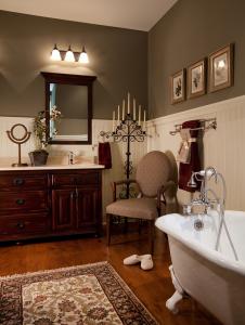 7. Choose Paint Colors That Complement Wood Undertones
Just as you want your colors to pair together well and your wood tones to pair together well, you want paint colors and wood undertones to complement each other, too.
For example, the right wood tones and hues can add warmth to an all-white room, while a bright white right next to wood can sometimes look and feel too cold. Making sure your paint colors complement your wood undertones can help you create a balanced palette with choices that complement and help create a cohesive look and feel.
8. Consider Room Placement and Lighting
Another tip for choosing colors and wood tones for your home design is to consider room placement and lighting. The lighting in a room will affect color perception and the way your colors and woods look in a room.
You will want to consider your indoor lighting options as well as room placement and window placement for natural light. Depending on window placement, north-facing rooms may be better-suited to warmer tones and hues, while south-facing rooms may be better-suited to cooler tones and hues or at least better able to handle them.
9. Test Colors and Wood Tones in Natural Light and Indoor Lighting
Because lighting can have such a big effect on how colors look in a room, it’s important to test samples of the colors and wood tones you are considering. Test samples of colors and wood tones under different types of light and throughout different times of the day to make sure you still like the way they look and that they are still creating the atmosphere you want.
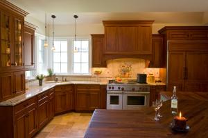 10. Repeat Specific Wood Tones to Make Different Tones Look and Feel Intentional
Although you don’t want everything to match or use too much of the same wood tone in a room or create looks that clash when using different tones, strategically repeating specific wood tones can make different tones look and feel intentional and cohesive.
Repeating a specific wood tone a couple of times throughout a space, especially in smaller furniture pieces or accessories, is a trick for mixing different wood tones in a way that works. Decor pieces, especially picture frames or even mirrors, are great ways to subtly repeat and incorporate specific wood tones. Placing mirrors strategically and getting creative with the frames are also home decor tips for using mirrors.
13 Mistakes to Avoid When Picking Colors and Wood Tones
Design rules and tips can provide guidelines for design and decor choices. Although there can be exceptions to the rule and good interior design can sometimes turn a “mistake” into a future-forward design that works, there are some general mistakes to avoid. Here are some mistakes to avoid when picking colors and wood tones:
- Having no plan or end goal to guide color or wood tone choices.
- Making choices without a palette in mind.
- Not balancing your palette with a dominant color, complementary colors, or accent colors.
- Ignoring the undertones of woods or colors.
- Picking colors first without considering already-fixed design elements.
- Using overly bright, neon, or bold colors.
- Leaving neutrals out of the palette completely.
- Using bright white right against wood.
- Mixing woods with clashing undertones.
- Forcing all wood tones to match.
- Using too much of the same wood tone.
- Overlooking wood grain patterns.
- Not taking room placement or lighting into account.
Design and Build a Custom Home With Custom Home Group
These are just a few considerations for how to choose colors and wood tones for your home design. Although there are general rules and tips to follow and mistakes to avoid, there are also exceptions to the rule. With the right design elements and combinations, what would be considered a mistake in a different design could create something innovative that works.
An experienced custom home builder with an in-house design process can help you navigate the possibilities and avoid the pitfalls to ensure you have a home design that suits your style and meets your needs. If you’re ready to get started on your own custom home in Central Pennsylvania or Northeastern Maryland, contact Custom Home Group at 717-284-4090. We can bring your dream home to life!